



Pixel PopersLets Talk

UI/UXDESIGNPEOPLE ENJOY

Interfaces that are researched, prototyped and tested — then handed to developers with every state and breakpoint covered.

Design my product

From sketch to screen

Wireframe → hi-fi

UX MAGIC ✦
LOW-FI
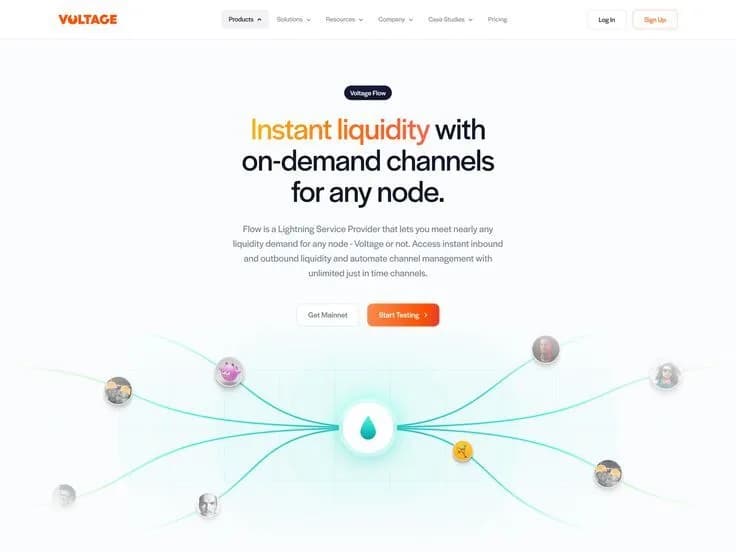
Hi-fi mobile landing page for a liquidity product, with a clear headline and call to action
HI-FI

Design systems

Components your devs will love

  • Button / Primary · Secondary · Ghost

    Get startedLearn moreSkip →
    Disabled
  • Input / Default · Focused

    Emailyou@brand.combarry@pixelpopers.com
  • Toggle · Checkbox · Radio

    ✓Remember meMonthly
  • Tags / Chips

    NewPopularSaleBeta
  • Avatar group

    Adan J.James AllenBarry Allen+12
  • Slider · Progress

    75%
  • Tooltip

    Saved to favourites ✓♥
  • Card / Product

    Fifth Sip coffee beans product shot
    Fifth Sip BeansMedium roast · 250g$18Add to bag
  • Tokens

    pinkgrapefizzsunnyink
    radius 8 · 16 · 28 · full

User flows

Journeys that feel obvious

  1. Flow 01 — first-time user
  2. LandingHome page
  3. Has an
    account?
  4. YES
    Log in1 field + magic link
    NO
    Sign upEmail or Google
    Onboarding3 quick questions
  5. DashboardPersonalised home
  6. Aha! ✦First win
  7. avg. 3 taps to first win

Responsive by default

One product. Every screen.

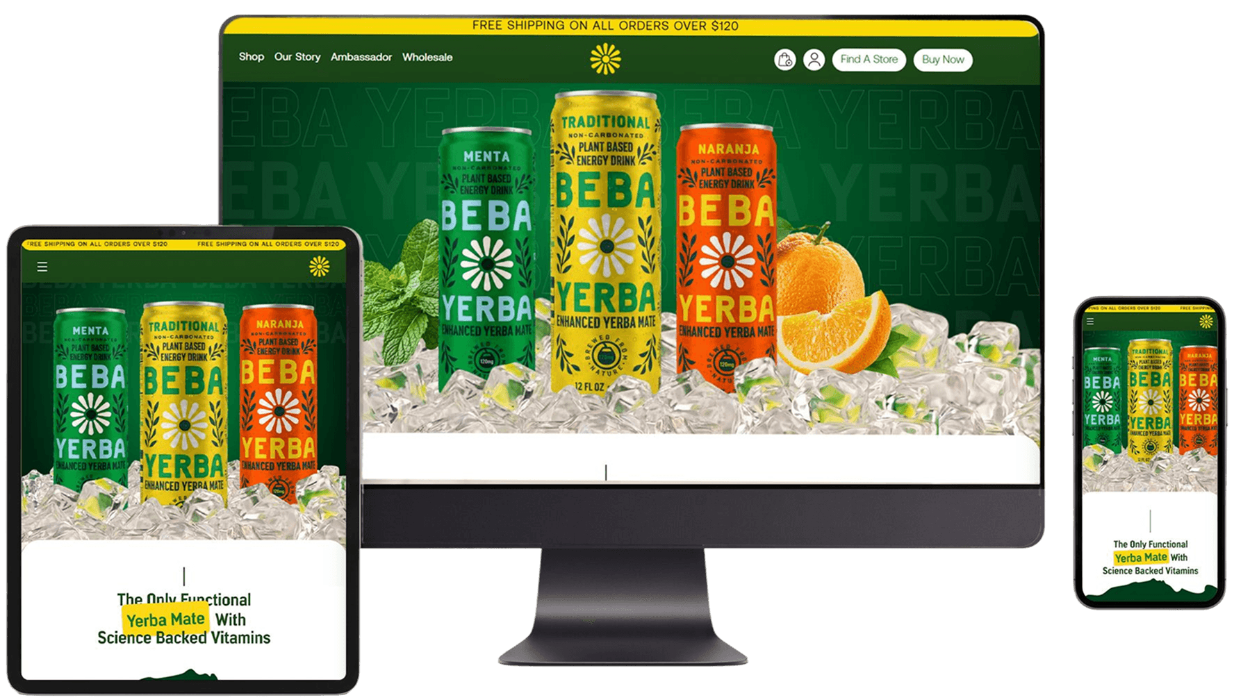
Every design is delivered for mobile (390px), tablet (768px) and desktop (1440px) breakpoints with a fluid type scale and thumb-friendly navigation.

Tested with

Real humans

Before anything ships we watch real people use it — tracking where they click, scroll and get stuck — then fix it.

  • Click & scroll heatmaps
  • 5-second tests
  • Task completion rates
  • A/B variants
liquidity.app — heatmap
Heatmap over a landing page: clicks cluster on the headline and the call-to-action button

73% clicked the CTA

after redesign (was 31%)

How we do it

Four artboards to launch

Tap an artboard to read the dev notes  ↘

  1. #  01 — Research

    Users hate long formsPrice is unclearLove the colours!Where is support?

    Note · 01 / 04

    We learn how your users think and where they get stuck through interviews, analytics and an audit. The output is a prioritised list of problems worth solving and the metrics we will improve.

    Research

  2. #  02 — Wireframe

    Note · 02 / 04

    We map user flows and build wireframes for the core journeys. Quick tests at this stage catch confusing navigation and missing steps while changes still cost minutes, not sprints.

    Wireframe

  3. #  03 — Design

    Hi-fi e-commerce screens designed in FigmaShop the dropBuy now

    Note · 03 / 04

    We craft the high-fidelity interface and build the component library alongside it. You review real screens in a clickable prototype, and we iterate together over structured feedback rounds.

    Design

  4. #  04 — Test

    • ✓Find a product
    • ✓Add to bag
    • ✓Checkout
    • Track order
    3 / 4 tasks passed

    Note · 04 / 04

    We run usability tests, fix what trips people up and prepare a clean handoff. Our team stays available during development to answer questions and review the build against the design.

    Test

THE FULL STORY

DESIGN THAT FEELS OBVIOUS (THAT'S THE HARD PART)

average conversion lift
+38%
products designed
40+
users per test round
5

Tools we love

  • Figma
  • FigJam
  • Maze
  • Hotjar
  • Lottie
  • Notion

Good UI/UX design is invisible. People do not notice the button that is exactly where they expected it, the form that only asks for what it needs or the dashboard that answers their question at a glance. They only notice when something is confusing — and then they leave. User experience design is the craft of removing that friction so your product feels obvious, fast and even a little bit delightful.

Our UI/UX design process starts with people, not pixels. We interview users, study analytics, map journeys and look closely at where people struggle today. That research turns into user flows and wireframes that define structure and priority before any colour is added. Only when the skeleton works do we bring in the visual layer: typography, colour, iconography, motion and the small interactions that give an interface its personality.

Everything we design lives in a shared, organised Figma file with a proper component library and design tokens. That means your developers get consistent, well-named components with every state documented — hover, focus, error, empty and loading — instead of a pile of one-off screens. Clickable prototypes let you and your users try the product before a single line of code is written, which saves weeks of rework later.

From mobile apps and SaaS platforms to e-commerce stores and marketing websites, we design interfaces that are accessible, responsive and on-brand. The goal is simple: more people completing the thing they came to do, and enjoying it while they do it.

What's included

Everything in the box

  • 01

    User research & audit

    Stakeholder interviews, user interviews, analytics review and a heuristic UX audit of your current product, summarised into clear problems and opportunities ranked by impact.

  • 02

    User flows & information architecture

    Journey maps, sitemaps and task flows that define how people move through your product, so navigation and content hierarchy make sense before any visual design starts.

  • 03

    Wireframes

    Low and mid-fidelity wireframes for every key screen, focused on layout, content priority and interaction, so we can test ideas quickly and cheaply.

  • 04

    High-fidelity UI design

    Polished, on-brand screens for desktop, tablet and mobile with typography, colour, iconography, illustration and micro-interactions that make your product feel premium.

  • 05

    Interactive prototypes

    Clickable Figma prototypes that simulate real flows, perfect for investor demos, stakeholder sign-off and usability testing with real users before development.

  • 06

    Design system & handoff

    A reusable component library with variants, tokens and documentation, plus a developer-friendly handoff with specs, assets and annotated states for every component.

Who it's for

Made for brands like yours

  • SaaS & B2B platforms

    Complex dashboards and workflows that need to feel simple for busy professionals.

  • Mobile app teams

    iOS and Android apps that need intuitive onboarding, clean navigation and better retention.

  • E-commerce brands

    Stores that want smoother browsing, faster checkout and fewer abandoned carts.

  • Start-ups building an MVP

    Founders who need a testable, investor-ready product design without wasting runway.

Good to know

The short guide

Guide 01

Why UX is a growth lever

Every extra step, unclear label or slow screen costs you users. Improving the experience of key journeys — sign-up, onboarding, checkout — is often the cheapest way to grow revenue, because you convert more of the traffic you already pay for.

Guide 02

Accessibility is good design

Designing for accessibility means readable contrast, clear focus states, sensible heading structure and touch targets that fit real fingers. It helps people with disabilities, improves usability for everyone and supports your SEO. We follow WCAG guidelines on every project.

Guide 03

Design systems save money

A shared library of components and tokens means designers stop redrawing buttons and developers stop rebuilding them. New features ship faster, the product stays consistent and onboarding new team members becomes far easier as you scale.

WHY TEAMS DESIGN WITH US

We combine brand designers' eye for detail with product designers' obsession with usability. That means your product does not have to choose between looking beautiful and working beautifully — you get both, backed by research rather than guesswork.

We also speak developer. Our design systems are built the way modern front-end frameworks think, with tokens, variants and documented states, which keeps the build fast and the final product faithful to the design.

Good questions

Asked &
answered

What is the difference between UI and UX design?

UX design is how a product works — the structure, flows and logic that help people complete tasks. UI design is how it looks and feels — the visual layer of type, colour and interaction. We do both together.

Do you design for both iOS and Android?

Yes. We design responsive web apps and native mobile apps, respecting the platform conventions of iOS and Android while keeping your brand consistent everywhere.

Will we get a design system?

Growth and Full Pop projects include a component library built in Figma with variants, tokens and documentation, so your team can design new features without starting from scratch.

Do you test designs with real users?

We do. Depending on the package, we run moderated or unmoderated usability tests with five or more users per round and share recordings, findings and the fixes we made.

Can you work with our in-house developers?

Definitely. We hand off clean Figma files with specs, assets and annotations, join your stand-ups if useful and review the build so the shipped product matches the design.

Can you build the product as well?

Yes — our web development team can turn the designs into a fast, accessible front end, which keeps design and code in perfect sync from start to launch.

Ready to pop?

Tell us where you are and where you want to be — we reply within a day with next steps.