Pixel PopersLets Talk

BRANDIDENTITYTHAT STICK

Logos, palettes, type and brand books that make you instantly recognisable — on a cup, a screen or a billboard.sdsdsadsad sad

Start your brandsSee the brand book ↓

Colour system

Palettes that feel like you

  • Primary

    Pop Pink

    #F27793

    RGB  242 · 119 · 147

    CMYK  0 · 51 · 39 · 5

  • Primary

    Grape

    #6A4B97

    RGB  106 · 75 · 151

    CMYK  30 · 50 · 0 · 41

  • Accent

    Fizz

    #3FB7C7

    RGB  63 · 183 · 199

    CMYK  68 · 8 · 0 · 22

  • Accent

    Sunny

    #F5C255

    RGB  245 · 194 · 85

    CMYK  0 · 21 · 65 · 4

  • Text

    Midnight

    #220128

    RGB  34 · 1 · 40

    CMYK  15 · 98 · 0 · 84

Typography

Display — Nevera

Pop! Wow. Yes.

Body — Haas Grot Disp

A typeface pairing with attitude: loud, rounded headlines meet a crisp, friendly grotesk that stays readable at every size.

Running copy — Archivo

  • Light
  • Regular
  • Medium
  • Bold
  • ExtraBold

ABCDEFGHIJKLMNOPQRSTUVWXYZ  abcdefghijklm  0123456789  !?&@

H1 120 · H2 76 · Body 22 / 36

Brand in the wild

Every touchpoint, on brand

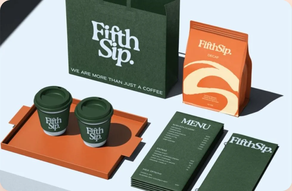
Fifth Sip coffee packaging: branded cups, tray, carrier bag, coffee pouch and menus
Packaging
Fifth Sip carrier bag and decaf coffee pouch
Merch
Kern café social media grid with branded cups and aprons
Social
Stationery kit
PPIXEL POPERS
Barry Allenhello@pixelpopers.com · pixelpopers.com
Letterhead
P
Envelope
PPIXEL
POPERS
BARRY ALLENFounder & Creative Directorhello@pixelpopers.com
+00 000 000 000
pixelpopers.com
Business cards
Social
POP!NEW DROP · FRIDAY
P
App icon
P✦!♥
STICKER SHEET
Stickers

The glow-up

Before & after

fifth sip coffee co.

(generic font, no system, no story)

Fifth Sip coffee identity applied to cups, a tray, a bag, a coffee pouch and menus
BeforeAfter
Before and after: a generic text logo for Fifth Sip Coffee Co. next to the finished identity system on packaging.

How we do it

Four chapters to a brand

Tap a chapter to flip it open  ↘

  1. CH.01

    Brand workshop, competitor scan & audience deep-dive.

    Discover

    CH.01 · Chapter one

    We run a brand workshop, audit your current materials, scan your competitors and talk to your audience where we can. This chapter ends with a short strategy document that everyone signs off before design begins.

  2. CH.02

    Story, voice & the one idea your brand owns.

    Position

    CH.02 · Chapter two

    We shape the story: your brand idea, personality traits, tone of voice and messaging pillars. This gives the visual work a clear brief and makes sure your identity says something, not just looks nice.

  3. CH.03

    Three routes, refined into one bold identity.

    Design

    CH.03 · Chapter three

    We present three different creative routes with mock-ups in real context. You choose a direction, and we refine the logo, palette, typography and graphic language over two rounds of feedback.

  4. CH.04

    Guidelines, assets & launch support.

    Roll out

    CH.04 · Chapter four

    We build the brand guidelines, export every asset, design your templates and support the launch. Need help briefing a printer or a developer? We stay on hand so the identity lands exactly as designed.

THE FULL STORY

A BRAND IS A PROMISE YOU CAN SEE

identities shipped
120+
routes per project
3
weeks, start to launch
4–8

Tools we love

  • Figma
  • Illustrator
  • Photoshop
  • InDesign
  • After Effects
  • Blender

Your brand identity is the first thing people meet and the last thing they remember. Long before anyone reads your About page, they have already judged you on a logo in a browser tab, the colour of a coffee cup or the feel of a box arriving at their door. Brand identity design is how we make sure that judgement lands in your favour — every single time, on every single surface.

At Pixel Popers we treat identity as a system, not a single logo. We start with strategy: who you are for, what you stand for and the one idea your business should own in people's heads. From there we design a mark that is simple enough to work at sixteen pixels and bold enough to hold a billboard, then build the colour palette, typography, illustration style, photography direction and graphic elements that let that idea travel.

The result is not a pretty file that sits in a folder. It is a toolkit your team can actually use: a brand book that explains the why behind every rule, ready-to-go templates for social posts, presentations and stationery, and assets exported in every format you will ever need. When your marketing team, your developer and your printer all pull from the same system, consistency stops being a struggle and starts being automatic.

Whether you are a start-up launching your first product, a growing company that has outgrown a DIY logo, or an established business that needs a refresh without losing its loyal customers, our brand identity process is designed to give you clarity, confidence and a look that is unmistakably yours.

What's included

Everything in the box

  • 01

    Brand strategy workshop

    A focused session to define your audience, positioning, personality and brand promise. Everything we design afterwards is measured against this foundation, so creative decisions are never just a matter of taste.

  • 02

    Logo design & variations

    Three distinct logo routes, refined into one primary mark plus secondary lock-ups, a compact icon and a favicon. Each version is built on a construction grid and tested at tiny and huge sizes.

  • 03

    Colour system

    A primary and accent palette with HEX, RGB, CMYK and Pantone values, checked for accessible contrast and tuned to look great on screens, packaging and printed paper alike.

  • 04

    Typography pairing

    A display and body typeface pairing with a clear type scale, weights and usage rules, so headlines feel loud, paragraphs stay readable and every document looks like it came from the same family.

  • 05

    Brand guidelines book

    A practical brand book covering logo usage, clear space, minimum sizes, the don'ts, colour ratios, typography, imagery, tone of voice and real examples — written so anyone on your team can follow it.

  • 06

    Applications & templates

    Business cards, letterhead, email signatures, social media templates, presentation decks and merch mock-ups, delivered as editable files so you can launch the new identity everywhere on day one.

Who it's for

Made for brands like yours

  • Start-ups & new ventures

    Launching something new and need to look established from day one without spending months on it.

  • Growing businesses

    You have outgrown a DIY logo and your marketing looks different on every channel. Time for a real system.

  • Product & packaging brands

    Food, drink, beauty and lifestyle products that need to win the shelf in under three seconds.

  • Rebrands & refreshes

    Established companies that want to modernise without losing the recognition they have already earned.

Good to know

The short guide

Guide 01

What makes a logo memorable?

Memorable logos are simple, distinctive and meaningful. Simplicity lets a mark be recognised at a glance and reproduced anywhere; distinctiveness separates you from competitors; meaning gives people a story to attach to it. We pressure-test every concept against all three before it reaches you.

Guide 02

Brand identity vs. brand strategy

Strategy is the thinking — who you serve, what you promise and how you are different. Identity is the expression of that thinking through visuals and voice. A strong identity without strategy is decoration; strategy without identity stays invisible. Our projects always connect the two.

Guide 03

Why consistency builds trust

People trust what they recognise. When your logo, colours and tone look the same on your website, packaging and social feed, customers remember you faster and feel safer buying from you. A clear brand book is what keeps that consistency alive as your team grows.

WHY BRANDS POP WITH US

We are a small, senior team, so the people in your kick-off call are the people designing your brand. There are no hand-offs to juniors and no endless chains of account managers — just direct conversations with the designers doing the work.

We also design for the real world. Every identity we deliver is tested on packaging, websites, social feeds and signage before we call it finished, and our guidelines are written in plain language. That is why our clients keep using their brand books long after launch instead of letting them gather dust.

Good questions

Asked &
answered

How many logo concepts do we get?

Three distinct routes. You pick a favourite and we refine it over two rounds of feedback until it feels exactly right — no endless revisions, just focused iteration.

Do we own the final files?

Yes. Once the project is paid, you own full rights to the final logo and brand assets. We hand over editable source files plus PNG, SVG, PDF and EPS exports for print and screen.

Can you refresh an existing brand?

Absolutely. We audit what is working, keep the equity your customers already recognise and modernise the rest, so the change feels like an upgrade rather than a stranger.

How long does a brand identity project take?

A Starter identity usually takes two to three weeks. Full identities with strategy and guidelines take four to eight weeks, depending on how quickly feedback comes back.

Do you also design packaging and websites?

Yes. Brand identity is often the first step; our UI/UX, web development and motion teams can carry the new look straight into your website, app, packaging and launch campaign.

What do you need from us to start?

A short questionnaire, access to any existing brand materials and one or two key people available for the workshop. We take care of the rest and keep you updated every week.

Ready to pop?

Tell us where you are and where you want to be — we reply within a day with next steps.