In this article
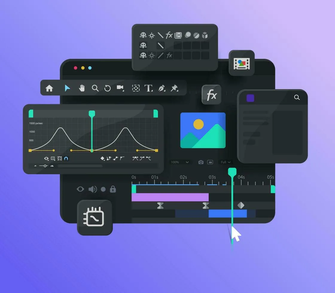
Motion is having a moment. Every brand wants animated logos, scroll-triggered effects and looping social videos. But a lot of motion on the web today is decoration for its own sake — things spin, bounce and fade simply because they can.
At Pixel Popers we have a simple rule: every movement needs a reason. When motion has a job, it makes brands feel alive and interfaces feel effortless. When it doesn’t, it just gets in the way.
The three jobs of motion
Almost every piece of meaningful motion falls into one of three categories:
- Explain — show how something works, how parts connect or how a process unfolds.
- Guide — direct attention to what matters next, or show where something came from.
- Delight — add personality at the right moment, so a brand feels human and memorable.
If an animation doesn’t do at least one of these jobs, we cut it. If it does two, we keep it and polish it until it shines.
“Motion should feel like the brand breathing, not the brand showing off.”
Give your brand a motion language
Just as a brand has colours and typefaces, it should have a consistent way of moving. Is it springy and playful, or smooth and precise? Do elements slide, pop or unfold? We define this in a short motion guide alongside the visual identity, covering easing curves, durations and a handful of signature moves.
- sweet spot for most interface transitions
- 300ms
- signature moves in a typical motion guide
- 3
- target for every web animation we ship
- 60fps
The result is motion that feels coherent whether it’s on a website, in a social ad or on a trade-show screen. People may not consciously notice it, but they feel the consistency — and it makes the brand feel more crafted and trustworthy.
Performance first, always
Beautiful animation that stutters on a mid-range phone isn’t beautiful. We build web motion with performance baked in from the start:
- Animate transform and opacity wherever possible
- Respect reduced-motion settings with calmer alternatives
- Load heavy animations only when they scroll into view
- Test on real, slightly old devices — not just new laptops
These habits keep sites fast, accessible and pleasant for everyone, including people who find a lot of movement uncomfortable.
Motion beyond the website
The same principles apply on social. Short, looping videos that make one point clearly will outperform long, busy edits almost every time. Design for the sound off, put the hook in the first second and make sure your brand assets — colour, type, logo — appear early enough that people know who they’re watching before they scroll on.
For product launches and pitch decks, a few seconds of explainer animation can replace paragraphs of text. Showing how something works is nearly always faster and more convincing than describing it.
Whatever the format, storyboard first. A rough sequence of sketches agreed before any animation begins saves days of revisions and keeps everyone focused on the message rather than the effects.
Start small
You don’t need a two-minute brand film to benefit from motion. Start with an animated logo sting, a few purposeful micro-interactions on your website and a set of templates for social video. Give each one a clear job, keep the movement consistent and your brand will start to feel a lot more alive.
Then watch how people respond. The animations that get screenshotted, shared or mentioned in reviews are the ones to build on; the ones nobody notices can usually go.
Motion done well is a quiet multiplier. It makes good design feel better, clear messages land faster and brands feel like they have a pulse.
- #Motion
- #Animation
- #Web

Written by
Barry Allen
Founder & Creative Director at Pixel Popers. Believes every brand deserves a little chaos.
Barry co-founded Pixel Popers in 2019 after years inside bigger agencies, watching brave ideas get sanded down until they were safe and forgettable. Today he leads the studio’s creative direction across brand identity, campaigns and motion, and has helped everyone from neighbourhood coffee shops to funded start-ups find a voice people actually remember. He writes about branding, marketing and the messy, joyful business of making things people notice. When he isn’t sketching logos on napkins, he’s probably arguing about typefaces or testing a new espresso blend in the studio kitchen.
Comments (2)
Elif T.1 week ago
Explain, guide, delight — such a clean way to critique motion work.
Sam O.2 weeks ago
Thank you for mentioning reduced motion. Too many studios forget it.